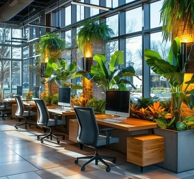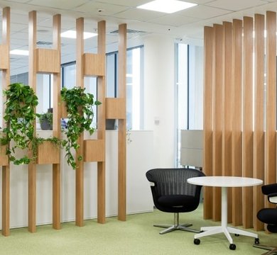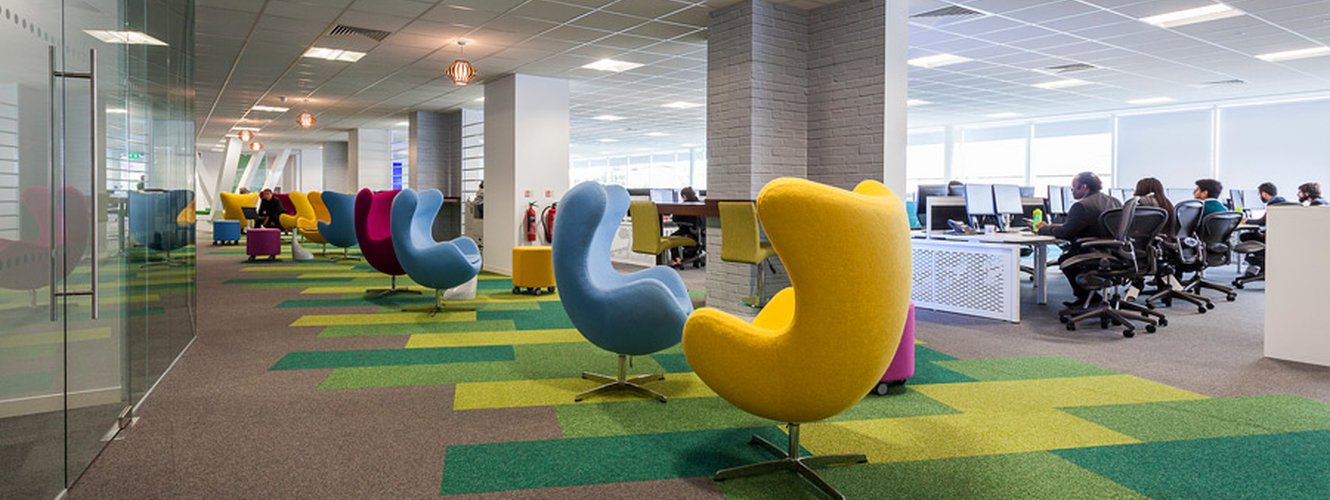
Are you beige or vanilla? As well as being shades of cream, these colour names are now being used to describe boring, uninteresting people and things. As office interior refurbishment and space planning specialists, we recognize there is a time and place for neutral colours – especially in the workplace – but adding a vibrant shade or pastel hue will bring your office to life and reinforce your brand.
The colour of 2018, according to PANTONE®, is Ultra Violet (18-3838 if you’re briefing a graphic designer). It’s a regal shade bringing to mind night skies and Dairy Milk chocolate but we appreciate that unless your brand features this specific purple, it might be hard to incorporate into a design.
Colour inspiration, however, can be drawn from anywhere. When it comes to shop fit outs and office refurbishments, we naturally look to a brand’s logo, heritage and design guidelines for a starting point. Of course, we can consult with you and create a whole new brand identity for your company, finding a new colour or different shade of the colour you already use to represent your values, ethos and direction – a particularly useful exercise if you’re targeting a new market or reshaping your business.
Want to work out the cost of an interior design project?
Our refurbishment cost calculator allows you to generate a guide figure in seconds.
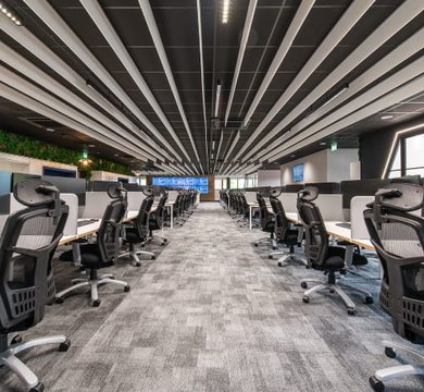
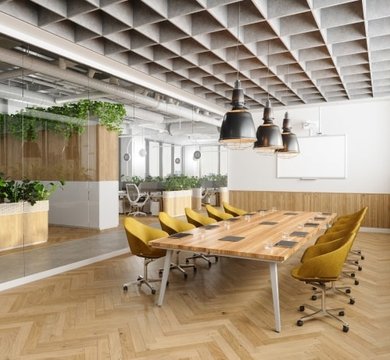
The process of bringing vibrancy and interest to an office is exciting, with our 3D layout designs giving clients an accurate representation of how an office will look when decorated - even down to the office chair upholstery. Here’s how to inject a dose of colour into your workplace:-
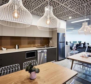
Softly softly – One of the quickest ways to add colour is to change your soft furnishings. Blinds, lampshades, cushions and sofas can be swapped for something more punchy.
Colour match – Many interior design items can be colour matched or dyed to a brand or specific shade, including computer chair upholstery, wallpaper and even carpets.
Try a tint – If you’re aiming for a more subtle effect, consider tinting a piece of office wall art. We have successfully tinted area maps and photographs with a brand’s colour for a softer wash effect. Our software also allows us to manipulate the colours of wallpaper and vinyl decals for a custom-colour result.
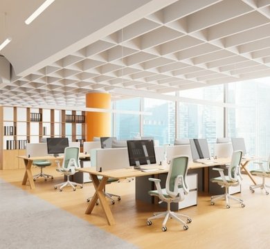
It takes two – If your brand consists of one colour, you can still pair it with a complementary or contrasting shade to create a versatile palette.
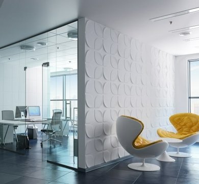
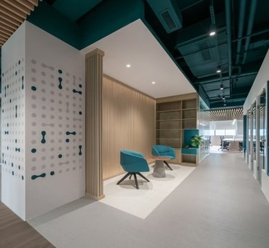
A bit on the side – Even if you love vanilla or beige as a paint colour, you can break up the neutral expanse with wall art and wall signage. From one-off canvass prints created by our in-house design team and internally-illuminated wall mounted logos to bar-style neon rope lights and stud-mounted lettering, a vanilla wall makes a great blank canvass.
For a free colour consultation and advice on using your brand’s colour in your workplace, contact MPL today.