If your approach to office decorating is to buy a huge tin of white paint and apply it to every surface, you will be missing the transformative effects of colour. As well as helping motivate employers and lift their spirits, people will make assumptions about your business based on the colours used in your workplace, such is the strong nature of colour psychology.
This guide is full of office colour ideas, with inspiration for overall colour schemes, small office colour ideas, and ways of making your walls really contribute to an inspiring, comfortable and professional environment.
Office Colour Ideas
Do you know what chromophobia is? It’s an intense, irrational fear of colour and it can manifest itself as an aversion to using colour in design. It’s a rare condition, however, so the sky’s the limit when it comes to office colour scheme ideas.
Using Colour Psychology in Offices
When refurbishing an office, the choice of colours is almost limitless and this can feel overwhelming. Thankfully, there is a great way to narrow down office colour ideas and identify what will really work for your workplace.
The principles of colour psychology work perfectly in office settings and as office fit out specialists, MPL always consider the impact of shades and hues when specific interior designs.
Studies have shown different colours can impact how we feel, behave and work. Yellow has long been used in creative environments as it stimulates, uplifts and energises. In contrast, red should be used with caution as it can lead to irritation, anger and impatience.
Additionally, colours can convey the nature of a business, brand or its industry. For example, blue is associated with security, strength, wisdom and trust. As such, a sophisticated shade of navy would work well in a solicitors’ office or in a wealth management setting.
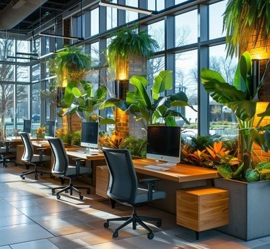
Green is an excellent colour for companies who want to purvey the image of freshness, energy and sustainability, and it’s often chosen by those working in health and wellbeing sectors.
The best office colour scheme ideas often come from collaborative meetings to discuss how employees need to be influenced (motivated, de-stressed, focused or inspired) and how the business wants to be perceived by visitors to the office.
Small Office Colour Ideas
If you are refurbishing a small office – perhaps a period or listed premises – you may have little to no control over the size and shape of the rooms. Although there is an unwritten rule about what small office colour ideas should be taken forward, some rules are there to be broken!
Light Colours to Maximise Space
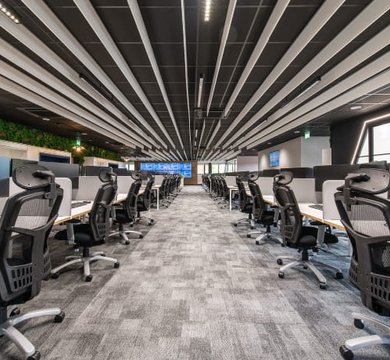
If there is a lack of space, there is good reason that small office colour ideas lean towards light and bright. Colours at the palest end of the spectrum – white, cream, light grey, beige, greige and subtle pastel hues – will create the illusion of space, reflect any natural light that enters the room and generally make the office feel more open.
The danger is the space feels cold and clinical – even if it is bijou in measurements. Depth and warmth can be added by choosing a darker but complimentary accent colour for the woodwork and furnishings.
Accent Walls and Minimalist Colour Schemes
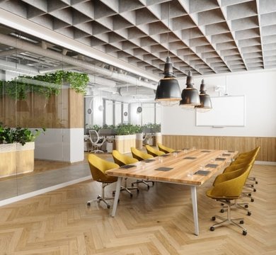
Small office colour ideas don’t have to err on the side of caution, however. Personality and warmth can be injected into a small office with an accent wall. Confining a bold shade of emerald green, opulent ochre or charcoal grey to one surface can create a really inviting atmosphere, and a block of colour can be broken up by the placement of artwork, mirrors or shelves.
Colour in small spaces can be easily curated if you stick to monochromatic designs or two-tone palettes. Colours could be complementary or contrasting but by keeping it simple, you’ll avoid overcrowding. Small office colour ideas to try include one colour on the walls, floor and ceiling, and another single colour for all furniture and accessories.
Office Wall Colour Ideas
Office wall colour ideas span many different design features. Paint, paper, panelling and plaster are all office wall ideas that can add a splash of colour as well as texture and pattern.
Feature Walls for Personality
You may love a certain colour but its personality traits are wrong for an open plan floor or where people work for most of the day. Perhaps your corporate colour is bright or fiery and, therefore, may be too overstimulating for every wall but that doesn’t mean the colour is off the table completely.
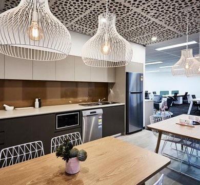
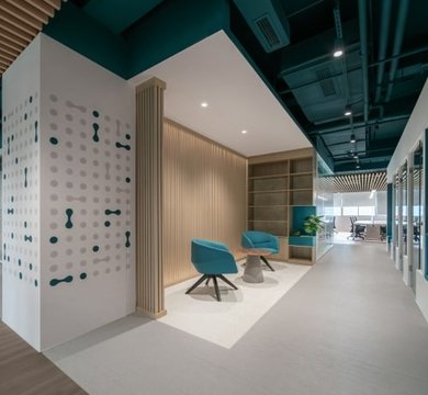
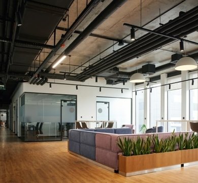
A feature wall is a great way of injecting a bold colour into a workplace, allowing businesses to veer away from ‘safe’ shades and follow interior fashions instead. We find break out areas, meeting rooms, kitchens and corridors are ideal places to explore colour, especially as colour can set the mood and draw attention to a particular area.
Colour consultancy is one of our core interior commercial & office design services, and we can help you embrace unusual and tertiary office colour ideas, such as amber, vermillion, magenta, amethyst, chartreuse and indigo. We’re also skilled in using corporate colours throughout the workplace.
Subtle Patterns and Textures
Sometimes a workplace really does need to be light, bright and airy, and the natural choice will be pale colours. That doesn’t mean that interest can’t be achieved. There is an amazing array of textured and patterned wallpaper that works exceptionally well in office environments, from the most subtle stripes to paper that feels like woven fabric.
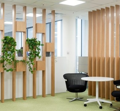
Wall treatments shouldn’t be overlooked either. Panelling can lend very subtle colour, pattern and texture, from a smooth concrete finish and pale grey brick slips to lime washed oak panelling and white timber slat walls.
Even the humble tin of paint can add an extra dimension. Choose a textured finish, high-sheen or dead matt variety and for a different aesthetic. The key to a cohesive, professional scheme is to plan each room and area in tandem with open plan and shared spaces, keeping to a curated colour palette.
Office Colour Scheme Ideas
Where to start with office colour ideas? Here are 3 options to consider:
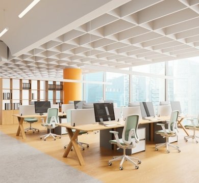
Neutral Tones with a Pop of Colour
If you’re not feeling very brave or are worried employees will quickly become bored of bold colours, neutral tones are your friend. You can dial into the benefits of colour psychology by adding pops of colour. Teal, orange and yellow are great accent shades. Check out the Dulux Colour of the Year 2025 – True Joy. It’s a rich yellow that is really uplifting in office settings.
Monochromatic Schemes
Out of all the office colour scheme ideas, a monochromatic colour scheme is a safe way to introduce colour without the danger of uncomfortable clashes. One single colour is chosen and different variations are used for a unified, professional look.
A monochromatic colour scheme is really versatile - bespoke shades can be chosen to suit different areas and surfaces. Blue is a popular choice as it is calm and sophisticated at the same time. We love the Dulux Colour of the Year 2022 - Bright Skies as a base for healthcare refurbishments.
Bold and Playful Schemes
Colour can make workplaces memorable and create immersive experiences that get brands noticed. Our refurbishment of The Purcell Rooms hair and beauty salon followed a botanical theme, bursting with lush shades of green and tropical wallpaper. Other design briefs need more careful consideration. We incorporated The Right Now Group’s corporate colours of black and tangerine orange into a corporate office, balancing bold with neutrals and biophilic elements.
The skill is in pairing clashing and complimentary colours with patterns and saturation. Successful office colour scheme ideas often start with a piece of art, a poster or a fabric (such as a Missoni rug), with the colours replicated in appropriate doses throughout the workplace.
Tips for Choosing the Perfect Office Colours
Consider Brand Identity
Whether a recognised brand bound by corporate colours, a refreshed identity or a start-up, it’s essential to align a company’s aesthetic identity with an interior design scheme. MPL’s retail interior design solutions achieve colour consistency, which is vital when it comes to omnichannel marketing and brand visibility. A logo or font colour can heavily influence office colour ideas, with the client able to choose maximum manifestation in the workplace, or a subtle nod.
Balance Functionality and Aesthetics
Professional office design teams will not be blindsided by the latest colour trends. Instead, they will take a corporate identity, room dimensions, orientation, natural light and intended use of space into account before creating a set of designs. Consulting with a designer is the only way to avoid an expensive colour mistake, a room that’s too dark to work in or a shade of purple that repulses everyone.
The power of colour in the workplace is not to be underestimated. It’s more than just pretty. You can set employees on the path of productivity by painting where they make their morning coffee yellow, encourage creative collaboration in a green-themed meeting room and soothe frazzled staff in a break out area decorated cornflower blue.
No one ever boasted about a plain, magnolia office. A bland workplace never photographed well or left a good lasting impression. Add colour and you can reinforce your brand and reinvigorate your workforce.