Just like in fashion, the world of interior design has trends that come and go. One of the areas subject to change is paint colours. From vibrant hues to soft shades, each year the major paint manufacturers announce which colour is in vogue for the next 12 months.
In this article, we discuss the Dulux Colour of the Year 2022 and how it can be used in an office environment. We’ll look at using this year’s most desirable blue as a wall-to-wall colour, as an alternative to grey, and as a complement to other colours and office textures.
5 Ways To Use Dulux Colour Of The Year In Your Office
The Dulux Colour of the Year 2022 is one of the most versatile chosen by the paint manufacturer for years. Here are five ways you can use Bright Skies in your office refurbishment:-
Wall-to-wall colour:
Dulux Colour of the Year Bright Skies is neutral and light enough to be applied to an entire room. It would work especially well in breakout areas and communal zones where this ‘optimistic blue’ will aid in clear thinking and clarity.
As an alternative to grey:
grey has been very popular for so long but get the shade wrong and it can feel oppressive or dull. Bright Skies is a viable alternative to grey – it is a cool blue with slightly grey undertones but it’s not cold.
Paired with metallics:
very few colours work with every metallic finish but Bright Skies is one of them. The shade would look fresh against silver, gold, copper and brass – brilliant versatility when choosing light fittings, hardware and door furniture.
On the ceiling:
Dulux Colour of the Year Bright Skies can be used in very unexpected ways with stunning results. This tranquil colour can be used to paint ceilings as a quirky alternative to white. It will create a sense of fresh space and clean horizons.
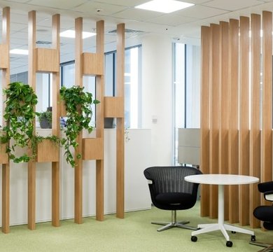
Combined with natural wood:
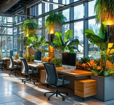
warmth is easily added to the Dulux Colour of the Year by using wood finishes. Whether this is a timber slatted wall feature, light oak office desks or a Scandi-style limed beech floor, blonde woods and pale blue walls create a contemporary look.
What Other Colours Go With Bright Skies?
The good news is Dulux Colour of the Year Bright Skies is a neutral shade up there with white, cream and pale grey. Don’t panic, however, if the thought of paint pairing leaves you bemused. Dulux has helpfully released a number of colour palettes with which Bright Skies matches. These include:
The Greenhouse colours: this collection of earthy tones includes shades of toffee, caramel and latte, together with blues that compliment Bright Skies - think steel and duck egg. Together the colours create a botanic, natural feel that work in any office environment, with Moon Cloud, Tranquil Dawn and Fresh Foliage providing a soft edge.
The Studio colours: the pastel tones of Dulux Colour of the Year Bright Skies work surprisingly well with pinks and lilacs. This suite of colours is a little reminiscent of sugared almonds, with Blood Orange adding a vibrant highlight and the dusky damson shades of Lilac Fancy and Violet Morning keeping the palette feminine.
The Salon colours: this is a highly sophisticated collection of colours that let the Dulux Colour of the Year take centre stage. Whisper-pale shades, including Cliff Walk, Letters Unread and Sloe Flower are joined by two strong neutrals - Rubble Road and Brave Ground. This palette is ideal for reception areas.
The Workshop colours: this suite is full of bold brights, where Bright Skies acts as a playful neutral. Treasured Coral, Healing Spice and Lemon Jester purvey an almost 1970s retro vibe when paired together - impact colours that are tempered with Bamboo Stem and Cloudy Dreams. Use to inspire and stimulate creative minds.
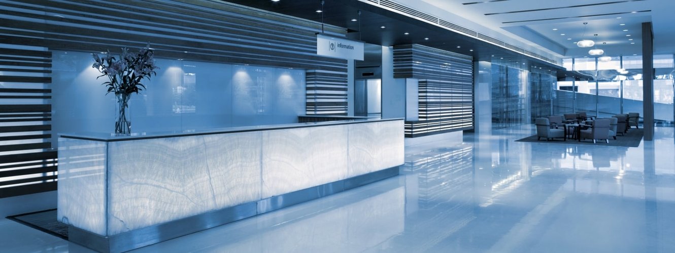
Dulux Colour Of The Year Is The Perfect Match For Your Reception
It’s easy to create a welcoming entrance with Dulux Colour of the Year Bright Skies, even if your reception area is on the small side. One of our most common interior office design solutions is to use light reflecting paint shades and materials in waiting areas and front-of-house spaces, and Bright Skies fits the bill.
This Dulux shade creates a sense of ozone, limitless space and more headroom, by making walls feel as if they’re receding and by making ceiling appear higher. Pair with reflective surfaces, such as mirrors, to amplify natural light.
Why Is Bright Skies Good For Smaller Breakout rooms?
Dulux Colour of the Year Bright Skies is an excellent choice for smaller breakout rooms, especially if you want to avoid a predictable colour, such as white or cream. Breakout rooms are places employees will go to relax and chill out, therefore the psychology of your colour choice matters. Pale blues are frequently associated with feelings of calmness and serenity, and verwell.com describe blue as a ‘peaceful, tranquil’ colour.
Refresh your workspace
If your workplace comprises a series of small offices and you’re fed up with very neutral, uninspiring walls, the Dulux Colour of the Year is a great way to add colour without going crazy. The subtle tones are perfect if you suffer from chromophobia - an abnormal fear of colour. The paleness of Bright Skies strikes the right balance between neutral and colourful - and painting the walls in this shade will instantly uplift your surroundings and your mood.
How to use Bright Skies without overpowering a room
If Bright Skies on every single wall feels too overwhelming, you can be more restrained with this colour. The Dulux Colour of the Year 2022 can be used on a feature wall - a look that’s especially airy and light when crisp white painted on the other walls. You could look for accessories in shades of Bright Skies - think lamp shades and window blinds, or even paint just the woodwork in Bright Skies and use the palest dove grey on the walls.
MPL Interiors can help you incorporate the Dulux Colour of the Year into your retail interior design or office refurbishment. Our mood boards and 3D designs illustrate how Bright Skies - or any other colour for that matter - can transform your workplace and improve the state of mind of your staff. Contact the team today to book a design consultation.