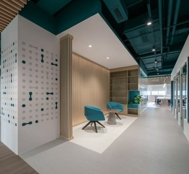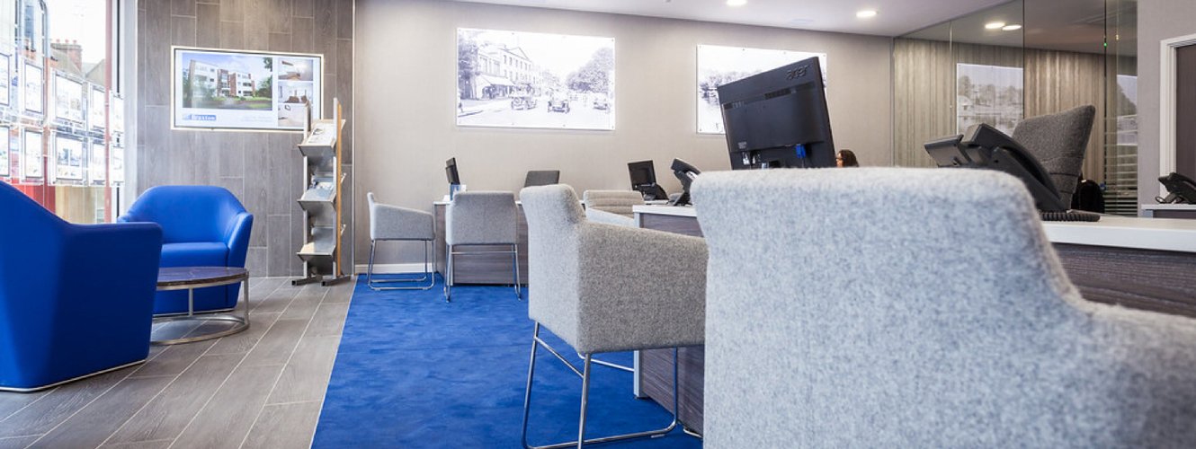
Pantone has announced its Colour of the Year for 2020 and we’ll be seeing a lot of Classic Blue in office design London. The shade communicates a sense of calm, reassurance, peace and tranquillity – a traditional colour that will not divide people as much as 2019’s ‘Living Coral’ did.
Colour experts have been quick to comment that Classic Blue is the perfect colour for the workplace, believed to be linked to communication, clarity and concentration. The shade is somewhere between cobalt and ink – a truly versatile option that can form the backbone of any interior design scheme.
Here are some colour pairings and accessory ideas we can incorporate into your workplace:-
Classic Blue and metallics - when used with gold, silver or copper, the Colour of the Year will create a sense of opulence. Try a Classic Blue wallpaper with graphic lines in bronze, or paint a feature wall in the dramatic shade and pair with rose gold accessories for a modern take on the traditional.
Classic Blue and pink - this pairing can stop the darker colour casting a heavy atmosphere. Coral, blush and powder pinks are a natural foil to Classic Blue, lightening the mood. Opt for a blue sofa peppered with pink cushions in your reception.
Classic Blue and orange - for a really zesty contrast, Classic Blue can be married with orange to provide an eye-catching contrast. Try shades such as tangerine, terracotta and amber for a fresh, modern vibe – combinations that work well as wall art.
Classic Blue and lime green - the punch and vitality of lime green is a natural partner for Classic Blue so don’t be frightened of this match. Office and occasional chairs upholstered in these two shades will lift any workplace but if you’re worried about overkill, ensure the backdrop is white.
If you’d like to embrace the 2020 Colour of the Year, contact MPL for ideas about working Classic Blue into your office interior design.